Properties
Properties are created using NASA JPL React Stellar FormField.
Create a src/vision/viewpoints/properties/propertiesLayouts.json file (case-sensitive)
The src/vision/viewpoints/properties/propertiesLayouts.json file is responsible for:
- Defining what OML Vision Properties can render
- Name of the Property
- Type of Property
- Queries for the Property content
- How to map Property queries to Property Layouts
- How to group Properties together
The file is formatted as a JSON data structure.
An example of what this looks like is seen below with the source code found here
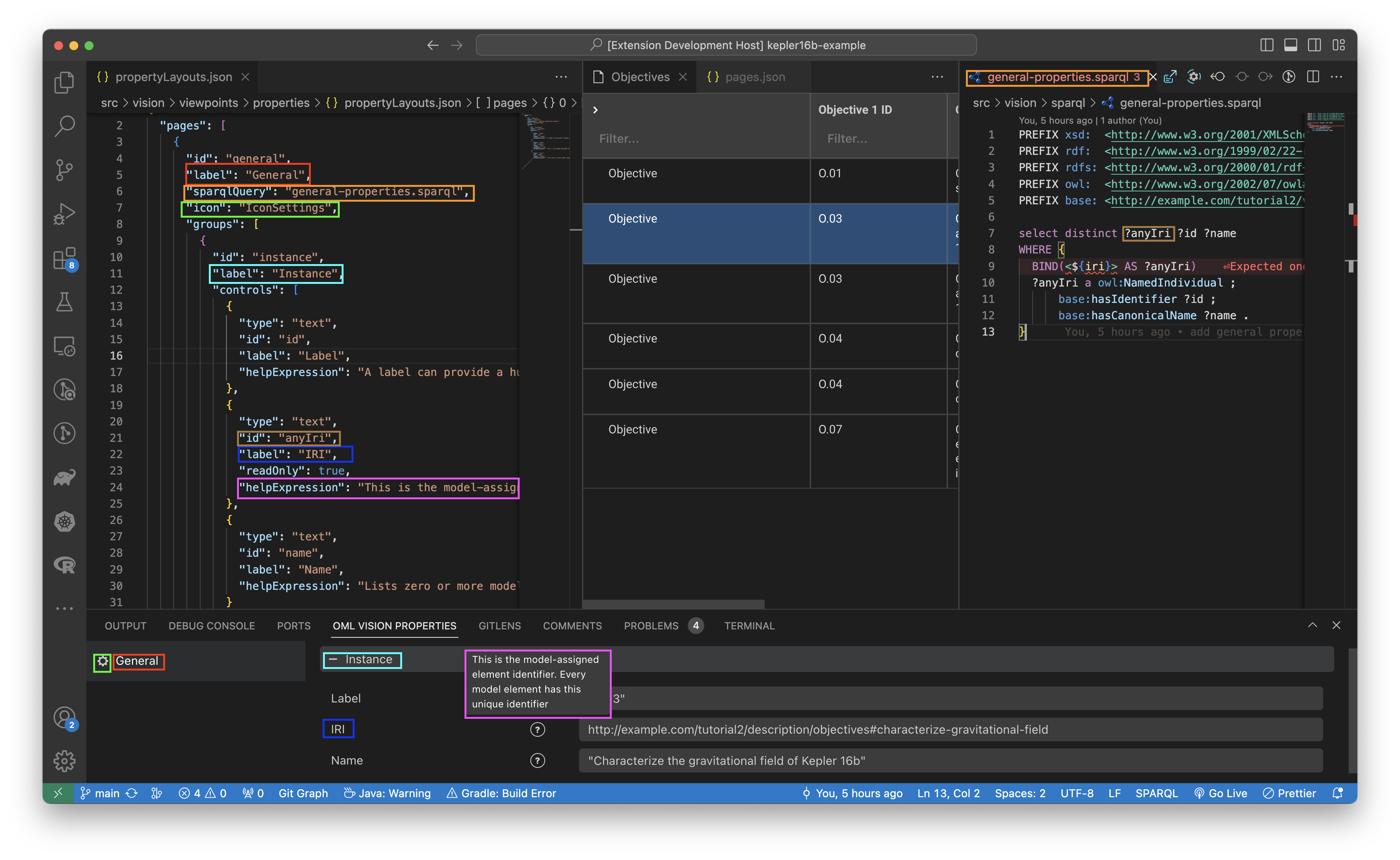
An example of how a src/vision/viewpoints/properties/propertiesLayouts.json file relates to UI elements is shown below.
Defining A Property
A Property must be properly defined in order to be rendered by OML Vision.
The following are JSON key-value pairs that can be defined for a Property.
id
id: string
This string defines the path to the Property.
label
label: string
This label defines the name of the Property that is rendered in the user interface.
sparqlQuery
sparqlQuery: string
This sparqlQuery contains the query that will query the RDF Triplestore for the content that will populate in the Property.
Look at the sparql docs for more info found here
OML Vision requires a unique identifier called an IRI in order to render content in the Property view. OML Vision can find the IRI of the selected element in the UI. The sparqlQuery must contain <${iri}>.
Examples:
icon
icon: string
The icon defines what icon to render next to the label in the UI.
OML Vision uses React Stellar for all icons rendered in the UI. For a full list of icons that are available, please refer to the official documentation located here.
groups
groups: []
The groups allow for data to be grouped together.
controls
controls: []
The controls allow for data to be rendered and updated by user input within a group.
type
type: string
The type defines what component to be rendered.
The component library for the possible components to be rendered is located here.
These are the current types
text- This type renders a VSCode Text Field.radio- This type renders a VSCode Radio.number- This type renders a VSCode Number Field.
The VSCodeNumberField is a custom component that is not a part of the standard vscode-webview-ui-toolkit library
helpExpression
helpExpression: string
The helpExpression explains to users what the control does. It is a tool tip.
readOnly
readOnly: boolean
The readOnly boolean indicates whether the control can be updated or not. A UI indicator is shown to the user when the control is read-only.
Refer to the not-allowed section in the CSS docs found here
Abilities
Collapse and Uncollapse Property Groups
You can collapse the property groups by clicking the - button and you can uncollapse the property groups by clicking the + button.
Tool Tips
Tool tips can be shown in the Property View by hovering over the tool tip icon.